The Color Red in Art History
There’s something about red. It’s the color of love and passion—fitting for Valentine’s Day—but also of fire, revolution, and, in Chinese culture, luck and prosperity. It’s a shade that can soothe or unsettle, unify or disrupt. Artists have long understood red’s emotional and symbolic power, weaving it into their works to make bold statements or evoke subtle feelings.
This blog follows the fil rouge (yes, that pun was irresistible!) of red throughout art history, tracing its many roles—from Matisse’s vibrant, unconventional Red Studio to Mondrian’s transitional The Red Mill, and from Yayoi Kusama’s polka-dotted infinity to the bold propaganda of Wu Shanzhuan. We’ll explore how this fiery hue has been used to inspire devotion, spark rebellion, and even redefine space itself.
But it’s not just about history. Red carries meanings that resonate with everyone in different ways—celebration, danger, love, or maybe something deeply personal. To help spark curiosity and conversation in your classroom or with your kids, I’ve included discussion prompts for each artwork. These are designed to encourage exploration, foster creativity, and inspire deeper engagement with art.
The Most Iconic Artworks Featuring the Color Red
Save for Later:


Table of Contents
Henri Matisse – The Red Studio (1911)

In 1911, Henri Matisse painted The Red Studio, depicting his workspace in Issy-les-Moulineaux, a suburb of Paris. Unlike his actual studio, Matisse saturated the canvas with a vibrant red hue, covering the walls, floor, and furniture. This bold choice wasn’t about realism but about creating a unified composition. The red flattens the space, eliminating traditional perspective and making the paintings, sculptures, and objects within the room stand out like focal points.
At the time, this approach was unconventional. The painting challenged expectations of how interior spaces should be represented. Critics and collectors struggled to understand its radical use of color and abstraction. For example, the work was rejected by a collector who had commissioned a different painting, and it remained unsold for several years. Today, however, The Red Studio is celebrated as a landmark in modern art, housed at the Museum of Modern Art in New York. Its daring use of red demonstrates how Matisse used color not just decoratively but as a way to evoke energy and redefine space.
Discussion Prompts:
- Matisse’s studio wasn’t actually red. Why do you think he chose this color for the painting?
- How does the red background change the way you see the objects in the room? Does it make them feel more connected or separate?
- Think of a space that’s important to you. What color would you use to represent it, and what would that color say about the space?
Resources:
- MoMA Exhibition: “Matisse: The Red Studio”
- MoMA Magazine: “Matisse’s Red Studio: Revealing an Artist’s World”
- MoMA Magazine: “Discovering the Red Studio”
- MoMA Collection: The Red Studio
Caravaggio – Saint Jerome Writing (c. 1605–1606)

Caravaggio’s Saint Jerome Writing shows the saint immersed in his work, translating the Bible into Latin—a task that would define his legacy as the author of the Vulgate. Jerome’s red robe stands out against the dark background, symbolizing passion, sacrifice, and the weight of his mission. The dramatic contrasts of light and shadow, a hallmark of Caravaggio’s style, add to the intensity, making Jerome’s concentration feel almost tangible.
During the Counter-Reformation, Saint Jerome became a key figure for the Catholic Church. While Protestants translated the Bible into local languages to make it more accessible, Catholics emphasized the importance of the Latin Vulgate as a unifying text for the faithful. Caravaggio’s stripped-down portrayal of Jerome reflects this effort to make religious art direct and relatable, focusing on his role as a translator and defender of tradition rather than on earlier symbols like the lion or cardinal’s hat.
Commissioned by Cardinal Scipione Borghese, the painting was both a devotional image and a statement of Catholic values. The use of red ties Jerome’s intellectual dedication to his spiritual fervor, making this a powerful example of how color can convey meaning.
Discussion Prompts:
- Why do you think Caravaggio used red for Saint Jerome’s robe? How does it shape the mood of the painting?
- How does the dramatic light help focus your attention? What might it say about Jerome’s work?
- Jerome’s role was central to Catholic tradition. How does this painting reflect the Church’s priorities during the Counter-Reformation?
Resources:
- Iconography of a Saint: Caravaggio’s Saint Jerome in Milan
- Saint Jerome – Collezione Galleria Borghese
- Saint Jerome Writing by Caravaggio in Borghese Gallery Rome
Lucio Fontana – Concetto Spaziale, Red (1968)

In Concetto Spaziale, Red (1968), Lucio Fontana presents a monochromatic red canvas disrupted by precise vertical slashes. These intentional cuts, or “tagli,” penetrate the surface, revealing the space beyond the canvas. Fontana’s choice of red is significant; the vibrant hue conveys intensity and emotion, while the slashes introduce a physical depth, challenging traditional notions of two-dimensional art.
Fontana, an Italian-Argentine artist, founded the Spatialism movement, aiming to synthesize color, sound, space, and time into a new form of art. His “Spatial Concept” series embodies this philosophy by transforming the canvas into a three-dimensional object, inviting viewers to consider the space within and beyond the artwork. The red color amplifies this effect, as it both attracts attention and evokes a visceral response.
By the late 1960s, Fontana’s slashed canvases had become iconic. His technique was not an act of destruction but a means of creation, opening the artwork to infinite possibilities. The red canvas, with its stark cuts, exemplifies Fontana’s innovative approach to art-making, where the voids become as significant as the material itself.
Discussion Prompts:
- How does the red color influence your emotional response to the artwork?
- What do the slashes in the canvas make you think about?
- How does this artwork challenge traditional ideas of what a painting can be?
Resources:
Concetto spaziale, Attese – Castello di Rivoli
Lucio Fontana: life, works, the importance of cuts
Red Dots Infinity Room – Yayoi Kusama


Yayoi Kusama’s Red Dots Infinity Room is part of her celebrated Infinity Mirror Rooms series, where mirrored walls create endless reflections of her signature polka dots, lights, and sculptural forms. This installation uses vibrant red dots on white surfaces, a recurring theme in Kusama’s work, symbolizing both personal and universal ideas. For Kusama, polka dots represent the infinite nature of the universe, dissolving boundaries and connecting individuals to something larger than themselves.
The room’s mirrors amplify this sense of infinity, immersing viewers in a surreal, otherworldly experience. Kusama’s use of red adds intensity and energy, creating a space that feels alive and almost pulsating. This artwork reflects Kusama’s lifelong exploration of themes such as repetition, infinity, and self-obliteration, rooted in her early hallucinations of endless patterns that deeply influenced her creative vision.
Red Dots Infinity Room invites viewers to step into a world that blurs reality and imagination, challenging perceptions of space, scale, and identity. Kusama’s installations are both playful and deeply introspective, offering a space for reflection on the interconnectedness of all things.
Read also:
Discussion Prompts:
- How does it feel to imagine being in a room where dots and reflections go on forever?
- Kusama uses red dots to represent infinity. What other shapes or patterns could symbolize something endless?
- Kusama says her dots connect people to the universe. What do you think she means by that?
Pompeian Red – Villa dei Misteri (1st Century BCE)

The Villa dei Misteri in Pompeii is famous for its vibrant frescoes, particularly the deep red backgrounds that give the room its dramatic atmosphere. This color, known as Pompeian red, became a symbol of Roman luxury and sophistication. It was made from iron oxide pigments and was widely used in Roman interiors. Interestingly, recent studies suggest this red might have originally been more of an ochre tone, changed by the heat from the eruption of Mount Vesuvius. Even so, the red we see today has come to define Roman art.
The villa gets its name, Villa dei Misteri (“Villa of the Mysteries”), from the frescoes in its triclinium (dining room). These paintings show life-sized figures participating in mysterious rituals, likely connected to the cult of Dionysus (Bacchus). The exact meaning of the scenes is still debated, adding to their intrigue. Painted around the 1st century BCE, the frescoes include vivid depictions of what many believe are initiation ceremonies. The bold red background ties the entire room together, making the figures and their actions feel more intense and alive.
The red backdrop also reflects the Roman Second Style of painting, which often aimed to create the illusion of depth and space. In the Villa dei Misteri, it transforms the room into an almost theatrical stage. Pompeian red wasn’t just decorative; it symbolized wealth, vitality, and cultural refinement. Here, it enhances the emotional weight of the rituals being depicted, lending the space a sense of drama and importance.
Discussion Prompts:
- Studies suggest Pompeian red started as ochre before turning red from volcanic heat. How does this change the way you think about these frescoes?
- How does the red background affect how you see the figures in the paintings? Does it make them feel more dramatic or connected?
- Imagine designing a room inspired by the Villa dei Misteri. What color would you use for the background, and why?
Resources:
- Pompeii Online: Villa dei Misteri Overview
- Pixartprinting: The Story of Pompeian Red
- Wikipedia: Villa dei Misteri
- Didatticarte: Villa dei Misteri Frescoes
- Cultura.gov: The Origins of Pompeian Red
Georgia O’Keeffe – Red Hills and Bones (1941)

Georgia O’Keeffe’s Red Hills and Bones (1941) is a striking exploration of the American Southwest, where the artist lived and found deep inspiration. The painting features undulating red hills juxtaposed with the stark whiteness of animal bones, elements O’Keeffe often used to express her connection to the desert landscape. The vibrant red of the hills contrasts with the smooth, organic forms of the bones, creating a balance between life and death, permanence and decay.
O’Keeffe’s use of color is central to the painting’s impact. The bold, earthy red evokes the sun-drenched desert terrain, while the bleached white bones suggest both fragility and timelessness. The composition’s simplicity highlights the shapes and textures of the hills and bones, transforming them into almost abstract forms. For O’Keeffe, the bones were not symbols of death but rather enduring markers of the landscape’s natural beauty.
Created during O’Keeffe’s time in New Mexico, Red Hills and Bones reflects her fascination with the desert’s vastness and its capacity to inspire contemplation. The work captures her unique ability to blend abstraction with naturalistic elements, evoking the essence of the Southwest without tethering it to specific details. Today, this painting remains one of her iconic pieces, celebrated for its bold use of color and ability to convey profound emotional and spiritual resonance.
Discussion Prompts:
- O’Keeffe often said that bones represented beauty and strength rather than death. How does this perspective change the way you view the painting?
- Imagine a landscape that feels meaningful to you. What colors and forms would you use to represent it?
Resources:
- Philadelphia Museum of Art: Red Hills and Bones
- Georgia O’Keeffe Museum: Red Hills and Bones
- Georgia O’Keeffe Net: Red Hills and Bones
Anish Kapoor – My Red Homeland and Svayambh (2003 and 2007)


Anish Kapoor’s My Red Homeland (2003) and Svayambh (2007) are monumental installations that use vivid red wax to explore themes of transformation, materiality, and temporality. Both works embody Kapoor’s fascination with the primal and elemental, emphasizing the physicality of materials and their ability to evoke visceral responses.
In My Red Homeland, a massive block of deep red wax sits at the center of a circular platform. A mechanical arm slowly rotates around the structure, carving, smoothing, and redistributing the wax. This ongoing process transforms the material over time, creating a sense of perpetual motion and renewal. Kapoor described this work as evoking ideas of home, territory, and belonging, with the red color symbolizing blood, life, and raw emotion.
Similarly, Svayambh—a Sanskrit word meaning “self-generated”—features a massive block of red wax slowly moving along tracks, leaving smears on doorways and walls as it passes through the space. This piece explores the relationship between the artwork and its environment, as the wax both shapes and is shaped by its surroundings. The movement of the wax block recalls ritual or pilgrimage, adding layers of cultural and spiritual significance to the work.
Kapoor’s use of red is deliberate and evocative, connecting his installations to themes of life, death, and transformation. The visceral quality of the color and material invites viewers to reflect on their own emotions, mortality, and the passage of time.
Discussion Prompts:
- Kapoor’s works often focus on slow, repetitive movements. How does this affect your perception of time while viewing them?
- In both My Red Homeland and Svayambh, the red wax is constantly reshaped. What do you think this symbolizes?
- Kapoor has described red as a “physical and emotional” color. How does the intensity of red in these works impact your feelings or thoughts?
- Imagine creating an artwork inspired by Kapoor’s themes of transformation and materiality. What material would you choose, and how would it evolve over time?
- Kapoor’s Svayambh is described as “self-generated.” How do you interpret this idea in the context of art and life?
La Japonaise – Claude Monet (1876)

Claude Monet’s La Japonaise (1876) captures the Western fascination with Japanese art, known as Japonisme, during the late 19th century. The painting depicts Monet’s wife, Camille, dressed in a vibrant red kimono adorned with gold and floral motifs, holding a folding fan. The striking red robe dominates the composition, emphasizing texture and pattern, while fans scattered throughout the background reflect Monet’s playful take on Japanese aesthetics. This work not only celebrates Japanese design but also comments on its adoption by European culture.
Monet, like many Impressionists, was inspired by Japanese ukiyo-e prints, which offered fresh perspectives on composition, bold use of color, and flattened space. These influences are evident in La Japonaise, where Camille’s figure contrasts sharply with the decorative patterns around her. Japanese art also shaped Monet’s broader practice, influencing his garden at Giverny and iconic works like his water lilies.
While the painting reflects admiration for Japanese design, it also serves as a light-hearted exploration of cultural identity, with Camille embodying the exoticized view of Japan popular in France at the time. The bold red kimono and intricate details make La Japonaise a standout example of how Eastern art enriched the Impressionist movement.
Read also:
- The History of Woodblock Printing: From Sacred Art to Packaging Material to Contemporary Art
- What Color is the Snow? Winter-inspired process art activity for children
Discussion Prompts:
- Look closely at the painting. Can you find any shapes, patterns, or designs that remind you of Japanese art?
- La Japonaise reflects both admiration for and appropriation of Japanese culture. How does this duality resonate with contemporary discussions about cultural exchange and influence?
- Monet was inspired by Japanese ukiyo-e prints, which often used flat colors and bold lines. How do you think this influence changed the way Impressionists painted?
External Resources:
- MFA Boston: La Japonaise Conservation in Action
- Claude Monet Art: La Japonaise
- MFA Boston: La Japonaise Collection Page
- Wikipedia: La Japonaise
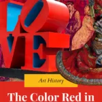
LOVE – Robert Indiana (1966)

Robert Indiana’s LOVE (1966) is one of the most iconic artworks of the 20th century. The bold sculpture features the word “LOVE” in uppercase letters, with the “O” tilted sideways. In this version, the letters are rendered in red with a blue and green background, creating a vibrant and dynamic visual effect. Originally designed as a Christmas card for the Museum of Modern Art in 1965, the work quickly gained popularity, becoming a symbol of the counterculture movement, peace, and universal love during the turbulent 1960s.
Indiana drew inspiration from his childhood experiences with his father’s job at a sign factory and the phrase “God is Love,” often seen in Christian churches. While the design looks simple, its bold typography and tilted “O” challenge traditional expectations of text in art. The red color adds an emotional intensity, symbolizing passion, vitality, and connection. Over time, LOVE has been reproduced in various forms, including paintings, prints, and public sculptures around the world.
Indiana’s LOVE transcends its original context, becoming a universal icon of hope and togetherness. Despite its ubiquity, the work remains a powerful statement about the enduring significance of love as a personal and collective ideal.
Read also:
Discussion Prompts:
- LOVE became a symbol of the 1960s counterculture movement. Why do you think this simple word resonated with so many people at that time?
- Imagine designing your own word-based artwork. What word would you choose, and how would you use color and shapes to make it stand out?
External Resources:
- Robert Indiana Official Website: LOVE
- Wikipedia: LOVE (Image)
- Buffalo AKG Art Museum: LOVE (Red, Blue, Green)
- MoMA Artist Page: Robert Indiana
- The Guardian: For Robert Indiana, There Was Always Power in Love
Red Humor – Wu Shanzhuan (1986)

Wu Shanzhuan’s Red Humor (1986) is a key example of post-Cultural Revolution Chinese art, reflecting the country’s complex relationship with its political history and cultural identity. Created during a period of significant social and political reform in China, the artwork critiques the propaganda and collective ideology of Mao Zedong’s era by subverting its most iconic symbols: red banners, slogans, and Maoist imagery. Wu’s use of red—a color closely tied to communism, revolution, and state authority in China—is both ironic and provocative, inviting viewers to question the legacy of these symbols in a rapidly modernizing society.
Red Humor is part of Wu’s broader Red Humour International series, which blends absurdity, irony, and cultural critique. The work often juxtaposes seemingly nonsensical phrases with authoritative typography, mimicking state propaganda while stripping it of meaning. This approach highlights the emptiness of overused political rhetoric and explores how language can be manipulated for control.
Emerging during the 85 New Wave Movement, Wu’s art embodies the spirit of experimentation and rebellion that characterized this pivotal moment in Chinese contemporary art. His work bridges traditional Chinese elements with Western postmodern influences, offering a unique perspective on China’s cultural transformation.
Read also:
External Resources:
The Red Mill – Piet Mondrian (1911)

Piet Mondrian’s The Red Mill (1911) marks an important phase in his artistic evolution, balancing traditional subject matter with the early experimentation that would later define his iconic abstract style. The painting depicts a Dutch windmill, a motif rooted in Mondrian’s heritage, rendered in bold red against a moody sky. The vibrant red and dramatic contrasts in light and shadow show Mondrian’s interest in symbolism and the emotional potential of color.
At this stage, Mondrian was influenced by Post-Impressionism and the emerging Cubist movement, which is evident in the geometric simplification of forms and the dynamic composition of The Red Mill. While still representational, the painting foreshadows his shift toward abstraction. The simplified shapes of the windmill and its strong vertical and horizontal lines hint at the grid-like structures that would later dominate his work in the De Stijl movement.
In The Red Mill, Mondrian experiments with using color and structure to convey harmony and balance, principles that became central to his later abstract works. This painting bridges his early representational phase and his development of pure abstraction, making it a pivotal piece in understanding his artistic journey.